HMI Programming Essentials for User-Friendly Manufacturing Systems
A good HMI does not draw attention to itself. Operators move through it without hesitation, maintenance technicians find what they need without digging, and supervisors trust what they see on the screen. When that happens, production feels stable. Changeovers shorten. Alarms get handled faster. Training takes less time. The interface becomes part of the machine instead of another obstacle standing between people and output.
That sounds simple, but anyone who has commissioned equipment knows how often HMI programming gets treated as the final cosmetic layer. Mechanical design gets the early focus. Controls logic gets the serious review. Safety receives the hard questions it deserves. Then the HMI gets squeezed into the last stretch of the schedule, when everyone is tired and the machine is already late. The result is predictable: inconsistent navigation, vague alarms, pages packed with data no one uses, and operators relying on tribal knowledge instead of the interface.
In manufacturing systems, that is expensive. It is especially expensive in cells that combine robots, conveyors, vision, clamps, and CNC automation, where one unclear screen can slow an entire process chain. Whether the system is built for machine tending, robotic welding, packaging, inspection, or assembly, the HMI often determines how much of the engineering quality reaches the floor.
The HMI is part of the machine, not a wrapper around it
The first shift in mindset is to stop thinking of the HMI as decoration. It is operational infrastructure. On many projects, the only part of the system most users will ever touch is the HMI. They will not read the PLC code. They will not review the robot teach pendant settings. They will not open electrical schematics unless something has gone badly wrong. Their understanding of the machine comes through the interface.
That means the HMI carries several jobs at once. It has to guide normal production, support setup, explain faults, expose status, protect critical settings, and help technicians work efficiently under pressure. Those goals can conflict. An operator screen that is wonderfully simple can hide the information maintenance needs. A technician page that exposes every internal bit and timer can overwhelm production staff. Good HMI programming resolves that tension by giving each user the right amount of control and visibility at the right time.
I learned this the hard way on a cell that loaded castings into a CNC lathe. The machine itself was reliable. The robot pathing was solid, the gripper had enough compliance, and the cycle time met spec. Yet operators kept calling maintenance for issues that were not equipment failures at all. The HMI had buried part-present diagnostics three levels deep under setup pages, while the main production screen offered only a generic “cycle inhibited” banner. Once we surfaced clamp confirmation, chuck status, and robot home interlocks on the main page in plain language, nuisance calls dropped immediately. Same machine, same controls, very different user experience.
Start with roles, not screens
Many weak HMIs come from jumping too quickly into page design. Someone asks for a home page, an alarms page, a recipe page, a maintenance page, and a trends page, and the project marches ahead. That approach produces screens, but not necessarily a coherent operating system for the machine.
A better starting point is the people who will use it. In a typical manufacturing cell, there are at least four distinct roles: operator, setup technician, maintenance electrician or controls tech, and supervisor or engineer. On larger systems there may also be a quality role or a production lead who needs access to counts and downtime reasons but not to motion settings. Each group enters the HMI with a different urgency, skill level, and goal.
The operator wants to know whether the machine can run, what it needs next, and what to do when it stops. The setup technician needs guided access to offsets, recipes, tooling positions, and sequence checks. Maintenance needs visibility into sensors, actuators, interlocks, I/O states, servo conditions, and fault history. Supervisors usually care about production counts, changeover timing, and recurring stops. If all of that information is crammed into one navigation structure without discipline, everyone suffers.
Role-based design also helps with access control. Not every setting needs a password, but not every setting should be one tap away either. I prefer systems where the production flow remains available without friction, while higher-risk functions are grouped logically and protected according to consequence. Changing a lot number is not the same as changing robot safe positions. Acknowledge that difference in the interface.
The best home screens answer three questions immediately
On a live plant floor, the home screen does not need to impress anyone. It needs to orient them in seconds. The most useful home screens answer three questions without requiring interpretation: what state is the machine in, what is preventing automatic operation, and what should the user do next.
That sounds obvious, but many home screens fail because they show too much low-value detail and too little actionable status. Animated conveyors and spinning motor icons may look polished, yet still leave an operator guessing why the cycle will not start. On the other hand, a clean process overview with clear permissive status can reduce confusion dramatically.
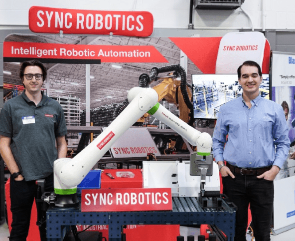
For machine tending cells, I like a main screen that shows the relationship between the robot, infeed, machine tool, and finished-part outfeed in one view. If the robot is waiting for the door-open signal from the CNC, say that clearly. If a pallet sensor is blocked, say which https://laneizqq442.iamarrows.com/choosing-the-right-industrial-automation-solutions-for-canadian-manufacturers pallet and where. If the gripper did not confirm part release, identify the tool and station. Do not force users to decode internal tag names or infer process sequence from generic fault text.
Robotic welding cells need the same clarity, but the critical states differ. Gas flow faults, fixture clamp mismatch, torch cleaning cycle status, and weld schedule selection matter more there than, say, spindle-ready logic. The HMI has to reflect the process, not just the controller architecture.
Naming and language make or break usability
One of the most common HMI programming mistakes is using controls-engineering language where process language is needed. Internal names may be precise to the programmer, but they are often meaningless to the people standing at the machine. “Station 3 PE not made” may be accurate if you know PE means photoeye and station numbering is obvious. To an operator, it can be useless.
Plain language does not mean imprecision. It means speaking in the terms people actually use. “Finished part not detected at unload conveyor” is longer, but it is immediately useful. “Lathe chuck unclamp not confirmed” is better than “M-code complete timeout” for most production users. Maintenance screens can expose lower-level details, but production alarms should still be readable under stress.
Consistency matters just as much as clarity. If you call it a gripper on one page, do not call it end effector somewhere else and end of arm tooling somewhere else unless there is a technical distinction that users actually need. In integrated robotic systems, terminology drifts quickly between mechanical, controls, and customer teams. The HMI should impose order. Decide on names early and use them everywhere: alarms, buttons, manuals, training, and tags where possible.
Alarm design should shorten recovery time
Alarm handling is where a lot of HMI systems reveal whether they were designed thoughtfully or assembled hurriedly. An alarm list that simply logs timestamps and messages is not enough. Good alarm pages help users recover.
The most effective alarm text usually includes three elements: what happened, where it happened, and what action is likely to clear it. You have to balance detail against screen space, but generic messages cost more in downtime than slightly longer text. “Robot fault” is almost never good enough. “Robot servo fault, check controller for active alarm” is only marginally better. “Robot axis motion fault during machine unload, verify CNC door fully open and reset robot controller if axis alarm remains active” is heading in the right direction.
Some situations benefit from layered detail. The active alarm banner can stay concise, while a drill-down window provides cause, likely checks, and any required reset order. That is useful on cells with interdependent equipment, where clearing faults out of sequence can create new delays. On a CNC automation line, for example, resetting the robot before confirming the machine tool has finished its alarm recovery can leave the system waiting in an awkward intermediate state. The HMI should guide that sequence instead of leaving it to memory.
Alarm flood is another problem. If one failed sensor causes fifteen downstream faults, users stop trusting the alarm list. PLC logic and HMI programming should work together to suppress derivative alarms when a root cause is already active. You do not need to hide useful information, but you do need to avoid overwhelming the person trying to restore production.
Navigation should feel predictable under pressure
A strong HMI does not require users to relearn it on every page. Navigation should feel consistent enough that a tired operator on second shift can find what they need without stopping to think. That does not mean every machine must use the exact same layout, but it does mean related functions should live in expected places, and navigation controls should behave the same way throughout the application.
I usually favor a shallow structure over a deep one. If critical setup or diagnostics live four taps down, people either will not use them or will call someone else. That said, making every function visible on the top level creates clutter. The practical middle ground is a stable primary navigation set, supported by context-sensitive links that appear when relevant. If a feeder fault occurs, a direct path to feeder diagnostics can save valuable time. If the machine is in manual mode, setup shortcuts that support jogging or sensor verification become more useful than production KPIs.
Visual hierarchy matters more than many programmers expect. Screen elements should guide the eye toward current state, required action, and abnormal conditions. Color helps, but color alone is risky. Plants are full of varying light conditions, older displays, and users with different visual sensitivities. Shape, labels, and spatial grouping should carry most of the meaning, with color reinforcing it.
Manual functions deserve more discipline than they usually get
Automatic mode gets the design attention because that is where throughput lives. Manual mode often becomes a patchwork of buttons added during debug. Months later, those same buttons are still there, sometimes unlabeled, sometimes hazardous, usually confusing. That is a mistake.
Manual screens are where setup time is won or lost, and where avoidable crashes often begin. They need careful thought. On systems with robots and end of arm tooling, manual functions should reflect the real physical sequence required for safe operation. If users must first establish a maintenance position, then confirm tooling state, then jog axes in a restricted zone, the HMI should support that flow explicitly.
A few principles consistently help:
- Make machine state obvious before enabling motion or actuation.
- Separate harmless manual actions from high-consequence ones.
- Require feedback after every command, especially when pneumatic or servo motion is involved.
- Group controls by physical area or mechanism, not by PLC data type.
- Build in reset paths that leave the machine in a known condition.
That structure becomes especially important in robotic welding cells, where torches, reamers, clamps, and part fixtures can all move independently. It is just as important in machine tending cells, where one ill-considered gripper open command near a chuck or vise can create a dropped-part event or damage expensive tooling.
Data visibility should support decisions, not decorate the screen
The temptation to add more data is strong. Modern HMIs can show counts, OEE estimates, fault frequencies, cycle trends, recipe history, quality prompts, and maintenance counters. Some of that is genuinely useful. Some of it is visual noise.
The better question is not “what data can we display?” but “what decision does this data help someone make?” If the answer is unclear, it probably does not belong on a primary screen. Operators need immediate feedback on actual versus expected cycle progression, not six miniature trend charts they never consult. Supervisors may benefit from reason-coded downtime and first-pass yield cues. Maintenance may gain real value from sensor cycle counters or vacuum-loss event history. Put information where the people who need it can act on it.
There is also a practical limit to what HMI-resident data can do well. For many machines, the onboard interface should present essential live and recent-history information, while longer-term analytics belong in plant-level systems. Trying to turn every local HMI into a full reporting platform often slows development and dilutes usability.
Recipe management is where usability and control discipline meet
Recipe handling is deceptively tricky. Everyone agrees it should be easy to select the right part program. Fewer people agree on how much flexibility users should have to edit recipe values, copy recipes, or create new ones at the machine. Those decisions depend on process risk.
In a low-risk assembly application, operators may be allowed to select among validated SKUs with minimal restrictions. In a robotic welding process, changing weld schedules, fixture timing, or part-family offsets may have quality implications that require tighter control. In CNC automation, a recipe can affect machine handshake timing, load orientation, gripper logic, or part count expectations. A wrong value is not just inconvenient, it can stop the cell or create scrap.
The HMI should clearly separate recipe selection from recipe editing. It should also make active values easy to verify. One of the most avoidable errors in manufacturing is running the right part with the wrong setup because the system technically accepted the combination. If a fixture, tool set, CNC program, and robot recipe need to match, the interface should verify that relationship aggressively and explain mismatches in plain language.
Good graphics are functional, not flashy
There is nothing wrong with a polished interface. Customers notice visual quality, and clean graphics build confidence. Still, HMI art should serve comprehension first. Every icon, color, and animation should earn its place.
Simple schematic process graphics usually outperform photorealistic machine drawings. They scale better across screen sizes, load faster, and are easier to read from a few feet away. Motion animation should indicate state or flow, not exist for its own sake. If a conveyor segment turns green and animates when running, that is useful. If every object pulses and glows constantly, users become blind to it.
Screen performance matters too. On larger projects, especially those with alarm history, recipe databases, and communications to robots or CNCs, heavy graphics can make screens sluggish. Users experience that lag as uncertainty. They tap twice, assume the first command did not register, and create their own problems. Fast, clear, modest graphics often age better than elaborate ones.
Commissioning is when the real HMI design happens
No matter how carefully you plan, the interface will change during startup. That is not failure. It is reality. Commissioning reveals where assumptions about workflow, terminology, and fault recovery do not match the floor. The smart move is to treat that period as part of HMI design, not merely bug fixing.
The most useful feedback often comes from watching people use the machine in silence. If an operator hesitates before every reset, something is unclear. If maintenance keeps bypassing the HMI and going straight to raw I/O diagnostics, the screen likely is not exposing the right signals. If setup technicians take notes on paper to remember sequence order, the HMI has missed an opportunity to guide them.
One plant I worked with had a compact tending cell serving two machining centers. During debug, the HMI seemed fine to everyone on the project team. After handoff, we noticed the operators repeatedly navigating to the robot diagnostics page just to confirm which machine the robot was serving next. The information was available, but not where they expected it. Adding a simple next-destination indicator on the main process screen eliminated the confusion. It was a small change with a measurable effect on confidence and pace.
Standardization helps, but only when applied with judgment
Many integrators and internal engineering groups try to standardize HMI programming across equipment. That is usually a good instinct. Shared navigation logic, common alarm formats, familiar color conventions, and consistent button behavior reduce training time and support burden.
Still, standardization should not harden into inflexibility. A robotic welding cell is not a palletizer, and a palletizer is not a CNC automation cell. Their operating rhythms, safety interactions, and failure modes differ. The standard should provide a strong backbone, not a straitjacket.
A practical standard often includes items like page structure, alarm philosophy, security levels, naming conventions, and common widgets for motors, valves, and sensors. Then each machine type can adapt the interface around process-specific needs. That balance keeps systems recognizable without forcing unnatural screens onto equipment that works differently.
What the best HMI programmers do differently
The strongest HMI programmers I have worked with are not just software people. They pay attention to how machines are actually operated, maintained, and misused. They ask what happens on second shift when supervision is thin. They think about gloved hands, dirty screens, tight cycle times, rushed changeovers, and multilingual environments. They know that a beautiful page that slows recovery by thirty seconds is not good engineering.
They also collaborate early with mechanical, controls, and process teams. Many interface problems begin upstream. If there is no clear agreement on state logic, naming, recovery sequence, or who owns recipe authority, the HMI will end up carrying the confusion. Getting those decisions aligned before page building starts saves an enormous amount of rework later.
Most of all, they remember that HMI programming is a human factors discipline inside an automation project. The code matters. The communications matter. The graphics matter. But the real measure of success is simpler: when the machine stops, can the person in front of it understand why and recover safely without unnecessary delay?
In manufacturing, that is not a soft benefit. It is throughput, uptime, quality, and trust made visible on a screen.
Sync Robotics Inc. — Business Info (NAP)
Name: Sync Robotics Inc.Address: 2-683 Dease Rd, Kelowna, BC V1X 4A4
Phone: +1-250-753-7161
Website: https://www.syncrobotics.ca/
Email: [email protected]
Sales Email: [email protected]
Hours:
Monday: 8:00 AM – 4:30 PM
Tuesday: 8:00 AM – 4:30 PM
Wednesday: 8:00 AM – 4:30 PM
Thursday: 8:00 AM – 4:30 PM
Friday: 8:00 AM – 4:30 PM
Saturday: Closed
Sunday: Closed
Service Area: Kelowna, British Columbia and across Canada
Open-location code (Plus Code): VHWR+PQ Kelowna, British Columbia
Map/listing URL: https://maps.app.goo.gl/xwtV2wEu8ZuKH3se8
Embed iframe:
Socials (canonical https URLs):
LinkedIn: https://www.linkedin.com/company/syncrobotics/
Instagram: https://www.instagram.com/syncrobotics/
Facebook: https://www.facebook.com/syncrobotics/
https://www.syncrobotics.ca/
Sync Robotics Inc. is an industrial robot and controls integration company based in Kelowna, British Columbia.
The company designs and deploys automation solutions for manufacturing operations across Canada.
Services include industrial robotics integration, controls integration, automation system design, deployment support, and related manufacturing automation solutions.
Sync Robotics Inc. is located at 2-683 Dease Rd, Kelowna, BC V1X 4A4.
To contact Sync Robotics Inc., call +1-250-753-7161 or email [email protected].
For sales inquiries, email [email protected].
Hours listed are Monday to Friday 8:00 AM–4:30 PM, with Saturday and Sunday closed.
For directions and listing details, use the map listing: https://maps.app.goo.gl/xwtV2wEu8ZuKH3se8
Popular Questions About Sync Robotics Inc.
What does Sync Robotics Inc. do?Sync Robotics Inc. designs and deploys industrial robot and controls integration solutions for manufacturing operations.
Where is Sync Robotics Inc. located?
Sync Robotics Inc. is located at 2-683 Dease Rd, Kelowna, BC V1X 4A4.
Does Sync Robotics Inc. serve clients outside Kelowna?
Yes—Sync Robotics Inc. is based in Kelowna, British Columbia and serves clients across Canada.
What are Sync Robotics Inc.’s hours?
Monday–Friday: 8:00 AM–4:30 PM; Saturday and Sunday closed.
How can I contact Sync Robotics Inc.?
Phone: +1-250-753-7161
General Email: [email protected]
Sales Email: [email protected]
Website: https://www.syncrobotics.ca/
Map: https://maps.app.goo.gl/xwtV2wEu8ZuKH3se8
LinkedIn: https://www.linkedin.com/company/syncrobotics/
Instagram: https://www.instagram.com/syncrobotics/
Facebook: https://www.facebook.com/syncrobotics/
Landmarks Near Kelowna, BC
1) Kelowna International Airport2) UBC Okanagan
3) Rutland
4) Orchard Park Shopping Centre
5) Mission Creek Regional Park
6) Downtown Kelowna
7) Waterfront Park